‘What is the need for a brand refresh?’
‘Do you have too much money at hand, to be investing in superficial things like a logo?’
'What is the need for a brand refresh at a time of such economic uncertainty?’
These were all the questions thrown at me by friends, family and mentor figures when I decided it was time for a brand revamp.
I started Ela India in 2018, a few months after leaving life in Bombay and moving to Palakkad, a small town in Kerala where my family had moved a few years ago. I had been the editor of a decor magazine before I quit the city life, so starting an apparel brand wasn’t the most natural impulse one would expect me to have.
This is why when I started the business, I didn’t want to invest in hiring a professional designer for the brand identity. I was unsure of what I was doing starting an apparel business, in the first place, and didn’t know how long this venture might last. But that was early 2018. Now in 2025, as we have crossed into our seventh year I felt like so much of the brand’s worldview had shifted, as had my own as a founder.
For one, we were now making our own printed textiles. In 2022, we produced our first printed yardage, exploring screen printing as a printmaking technique. At the time we started working on the collection, COVID was only just being wiped away from our consciousness, but travel was still quite restrictive. The planning, sampling and production all happened remotely, without us being able to look at the samples in person. We were exhilarated when we got to see the first samples. There was ample room for improvement but for once, the joy of seeing something we had visualised come to life took over that sense of perfectionism.
Since then, we have launched a new print and colour palette every single year. We have gone deeper into investing in our own printed yardage, with plans to diversify into home textiles and an accessories line.
Ela has been a part of my story - of leaving Bombay and starting something from scratch, pursuing a dream I have had since i was a kid. But as a business that needs to grow beyond the founder, i felt it was time to set a new narrative for the brand.
We are no longer just an apparel brand, and so, the brand identity that I had made with my very questionable photoshop skills back in 2018 felt disingenuous, when we were investing so much time and energy into a different way of doing business. Didn’t our brand deserve to be aligned with the new narrative we were setting for ourselves? The answer, of course, is yes.
I have been following Vaishali’s work over the last few years. She runs 85: 15, an architecture firm doing exceptional work, with a branding division under Studio Half Cup. I was drawn to the emphasis they put on visual research in crafting brand narratives. After a few emails that were exchanged regarding the brief we had in mind, Vaishali and her able team were on board with the business of crafting a new narrative for us.
Lots of weeks, zoom calls, sketch drafts, presentations, emails and texts later, we were all happy with the final rendition of what Ela India’s new brand identity would look like.

Let the Studio Half Cup team describe it in their own words
Ela is ‘leaf’ in Malayalam.
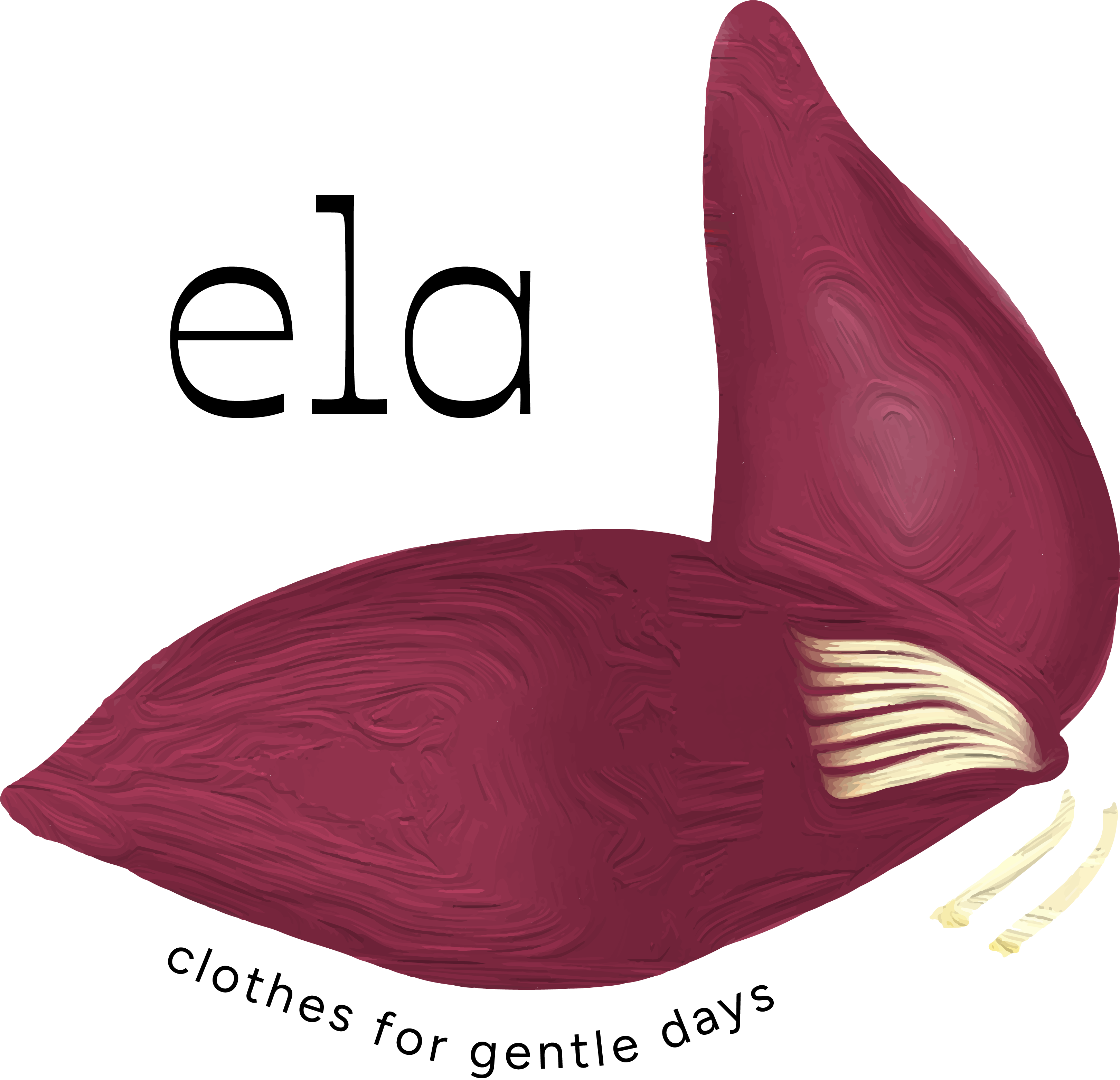
Rather than giving the brand a very literal identity, we felt it would be better suited to use the symbol of a banana flower. The banana plant is deeply woven into the culture and cuisine of Kerala, making it an ideal representation of the brand’s strong connection to its roots.

Our rebrand focuses on highlighting textures, bold colours, and the elegance of contemporary clothing.

This concept is reflected across the entire brand language.
The logo features a partially opened banana flower, with intricate details and vivid hues in its petals. This illustration, paired with a modern, clean slab-serif typeface in both Malayalam and English, reflects the brand’s philosophy of slow and conscious living.


A big thank you to Vaishali, Praveen & the rest of the team for this beautiful articulation of our brand story. What do you think of our new brand identity?
Leave us a comment and let us know.

